Chicago - "L"

Chicago's "L" passenger information has a distinctive style, and was generally of high quality. The relatively pale colors on a white background gave system maps and related items almost a cute look. Station platforms featured large signs with the first letter of the station name; highly glanceable, but also potentially confusing when Damen and Division are consecutive stations.
Onboard a newer "L" train
The after-station "X is Next" announcement is frequently followed by a PSA announcement. This happened far too often and quickly grew irritating. But no Chicagoan can ever claim they don't know that "soliciting and gambling are prohibited on CTA vehicles."
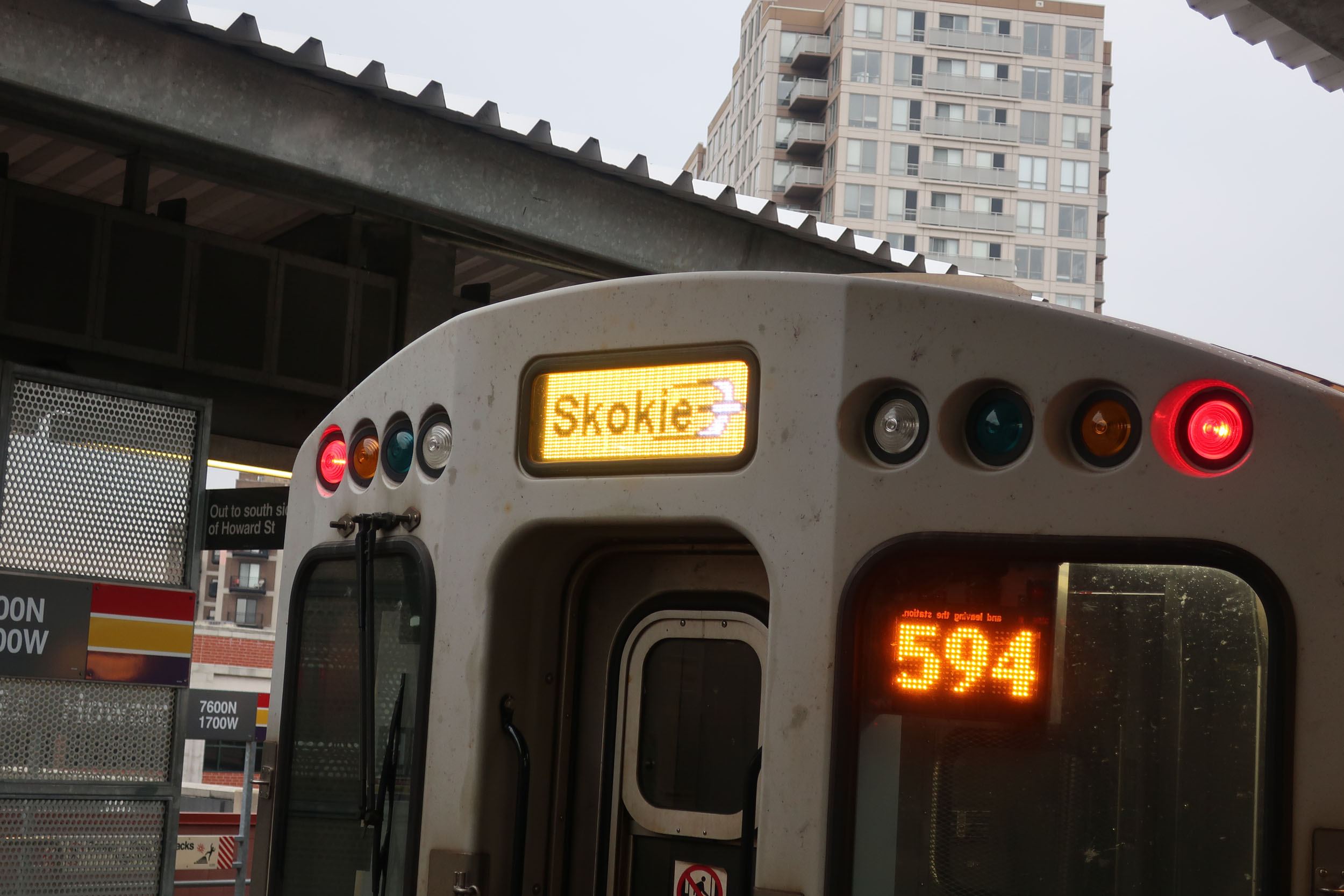
Headsigns on the newer cars are full-color LED panels. The designs emulate the colorful rollsigns they replaced.
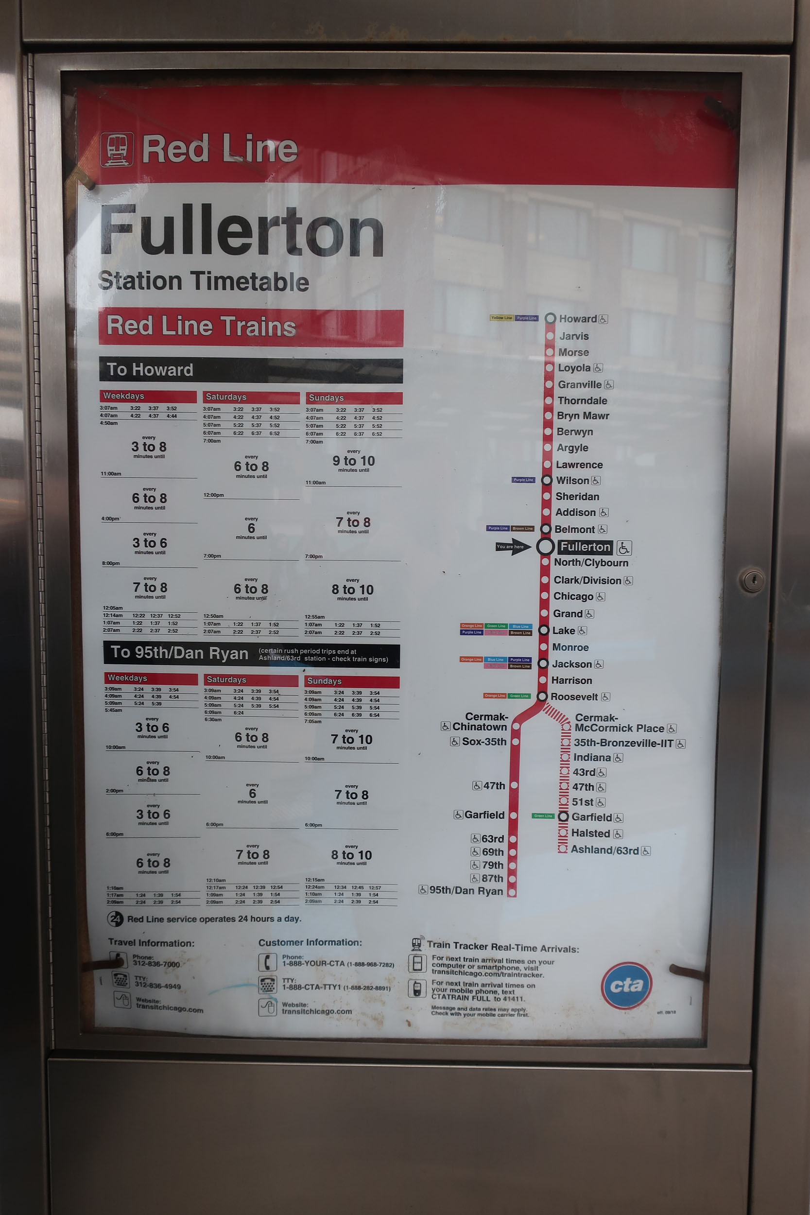
Wayside & Platform
Signage at platform level:

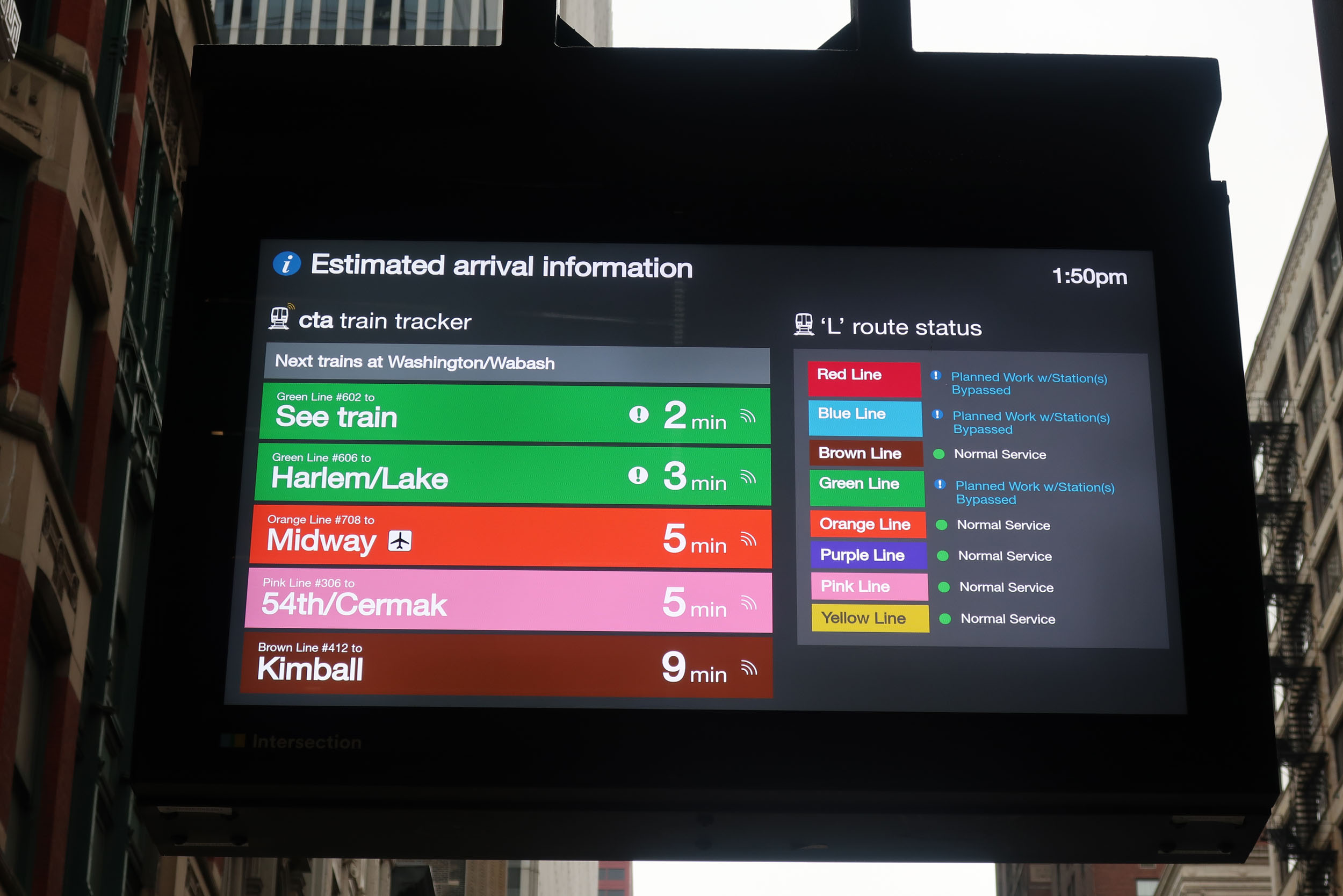
At street level, many stations had multiple Intersection-branded video displays that showed predictions and ad content. The placement blurred the line between station entrance and non-station sidewalk, but the result was highly visible passenger information:

← Back to Passenger Information Archive …